A Step-by-Step Guide to Building an Effective Social Media Dashboard
Discover what an effective social media performance dashboard looks like. Learn what the important metrics to track are and what tools to use.


It’s Monday morning. I’ve just opened my laptop, coffee in hand, when a message pops up: “Hey! Can you share a quick update on our social media marketing performance?”
My first instinct? Mild panic.
But not if I’ve got a social media dashboard.
Instead of jumping between platforms, exporting spreadsheets, and trying to make sense of scattered numbers, I open one clean view and everything’s right there. Engagement trends, top posts, growth, even what worked (and what didn’t).
A good dashboard can provide instant clarity and actually help understand performance, not just report it.
In this guide, we’ll learn how to build a social media dashboard, key elements and metrics it should include, and best practices you can adopt.
Key takeaways
-
Key metrics to include in your social media dashboard: Focus on a balanced mix of engagement, awareness, audience, content performance, conversion, and executive-level metrics to fully understand both content impact and business results.
-
Best social media reporting and dashboard tools: Use native analytics for quick insights, a tool like Socialinsider for unified and automated reporting, and Looker Studio for highly customizable dashboards.
-
Best practices for building a social media dashboard: Design dashboards that prioritize decision-making by combining clear summaries, structured data layers, and contextual comparisons to turn insights into actionable next steps.
What is a social media dashboard?
A social media dashboard is a centralized view that pulls data from multiple social platforms and presents it in a clear, visual format. It helps you track performance, spot trends, and make decisions without digging through separate analytics tools.
Instead of switching between Instagram, LinkedIn, TikTok, and spreadsheets, a dashboard brings everything into one place and turns raw numbers into insights you can actually use.
Why every team needs to invest in a social media dashboard?
Here are four reasons why I think everyone should use a dashboard.
- Resolves the pain of scattered data: No more jumping between five tabs and still feeling like you’re missing something. A social media monitoring dashboard pulls everything into one place so you can finally see the full picture without the chaos.
- Faster decision-making with quick data: When your data is already organized and visual, you don’t waste time figuring out what’s happening. You can jump straight to deciding what to do next.
- Better team alignment and stakeholder reporting: Everyone, from social media managers to leadership, looks at the same numbers, presented clearly. This helps everyone make decisions that are based on the same data.
- Spot trends and changes early: Whether it’s a sudden drop in engagement or a post unexpectedly going viral, a dashboard helps you catch it early so you can react (or double down) before it’s too late.
Key elements of an effective social media dashboard
Whether you are prioritizing engagement or awareness data, these are common elements a dashboard should have.
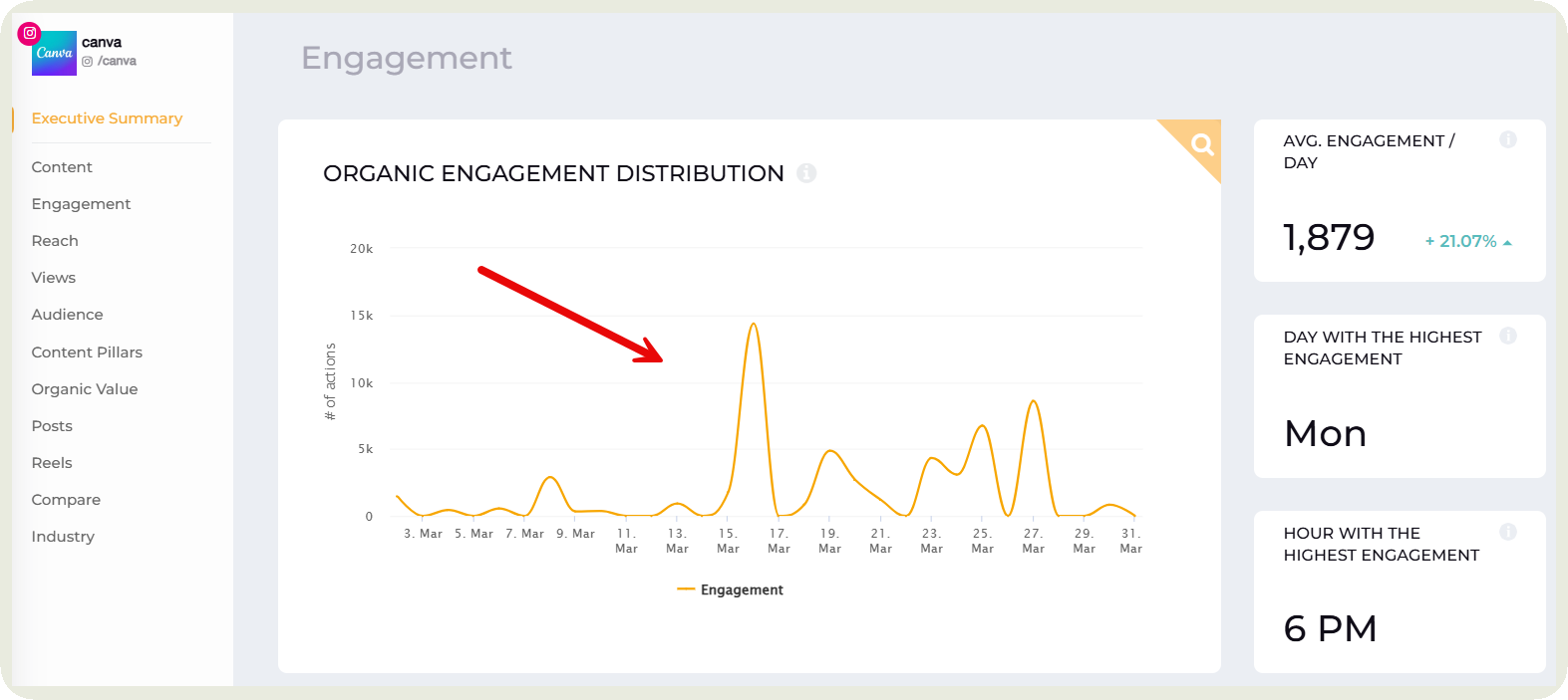
Real-time data on key metrics
This is where I always start when looking at a social media marketing dashboard. I want to know what’s happening right now, not what happened last month after it’s already too late to act. Real-time data gives you that instant clarity.
Whether it’s engagement, content performance, or audience growth, your most important metrics should be front and center. These metrics should be available at just a quick glance which helps get the pulse of your social media.
Here’s how I use Socialinsider’s topmost section to display these metrics.
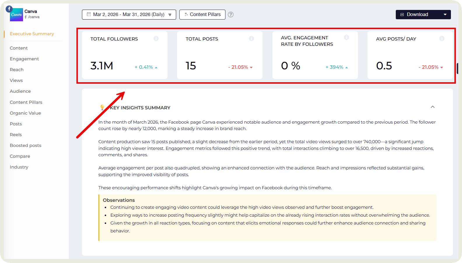
It also changes how you respond. If something is picking up traction, I can lean into it immediately. If performance drops, I notice it early and adjust. Over time, this makes your workflow feel less reactive and more in control.
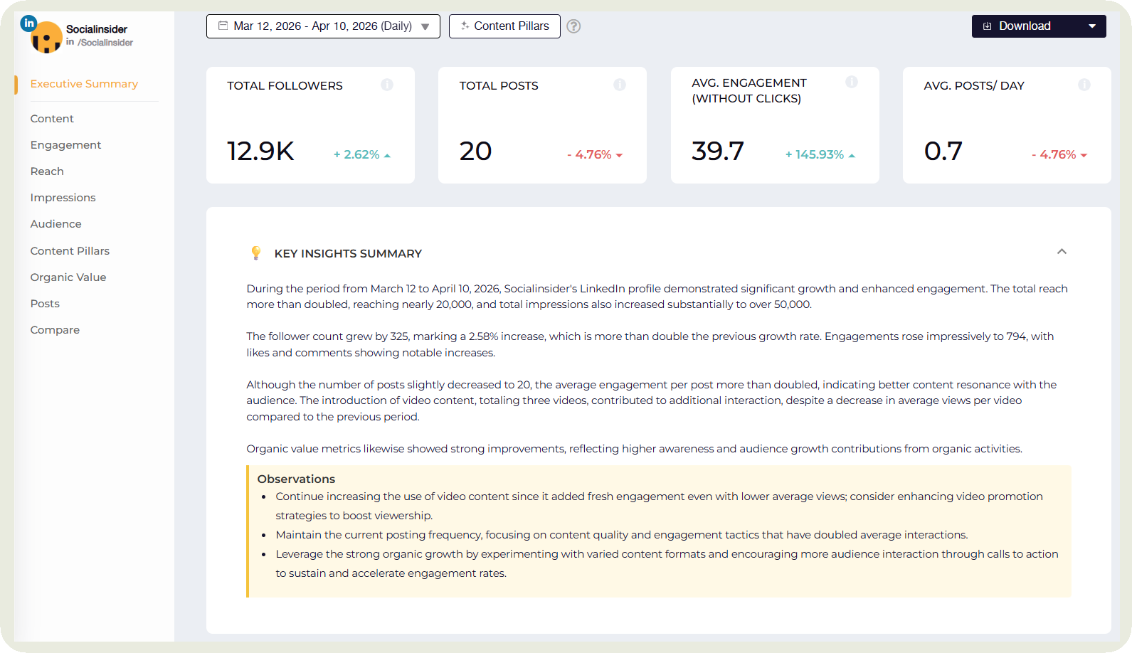
Executive summary
I usually like having a summary of my social media performance displayed on the social media dashboards.
It shows quickly what happened and also gives suggestions on what needs to change.
Socialinsider generates this automatically for the selected time period.
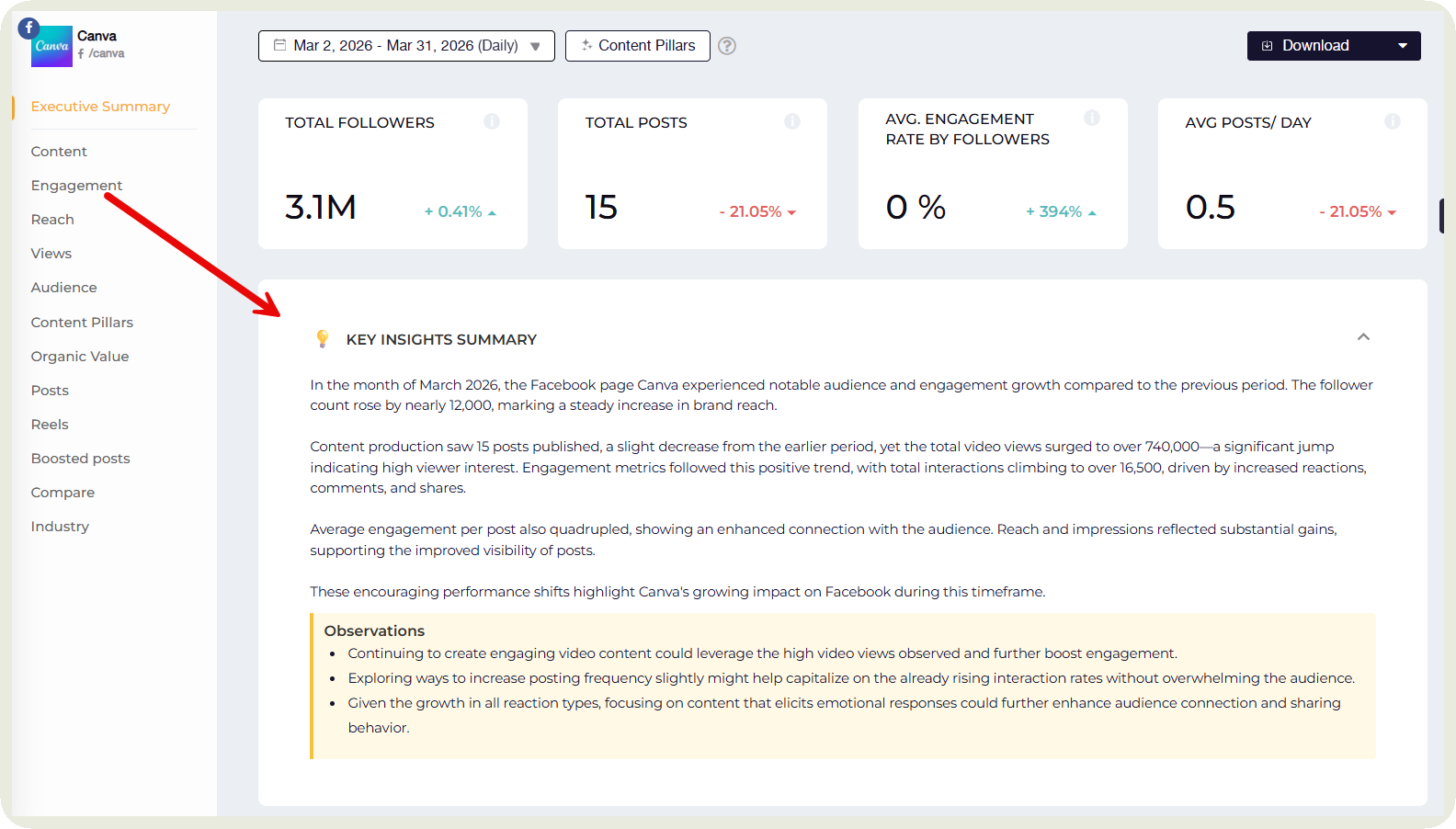
A good executive summary can include:
- A quick snapshot of overall performance for the selected time period
- Key wins, like top-performing posts or standout campaigns
- Noticeable drops or underperforming areas that need attention
- Trends across metrics, like engagement going up or reach declining
- Platform-level highlights, showing where things worked best
Simple, actionable suggestions on what to do next
Multi-platform integration capabilities
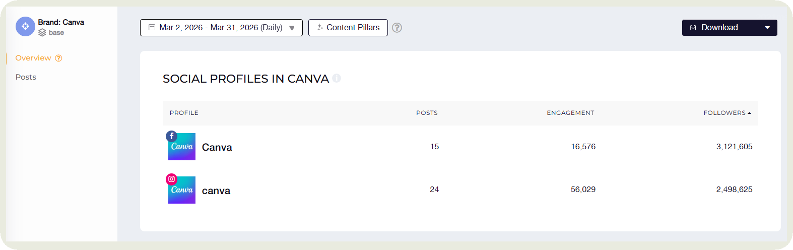
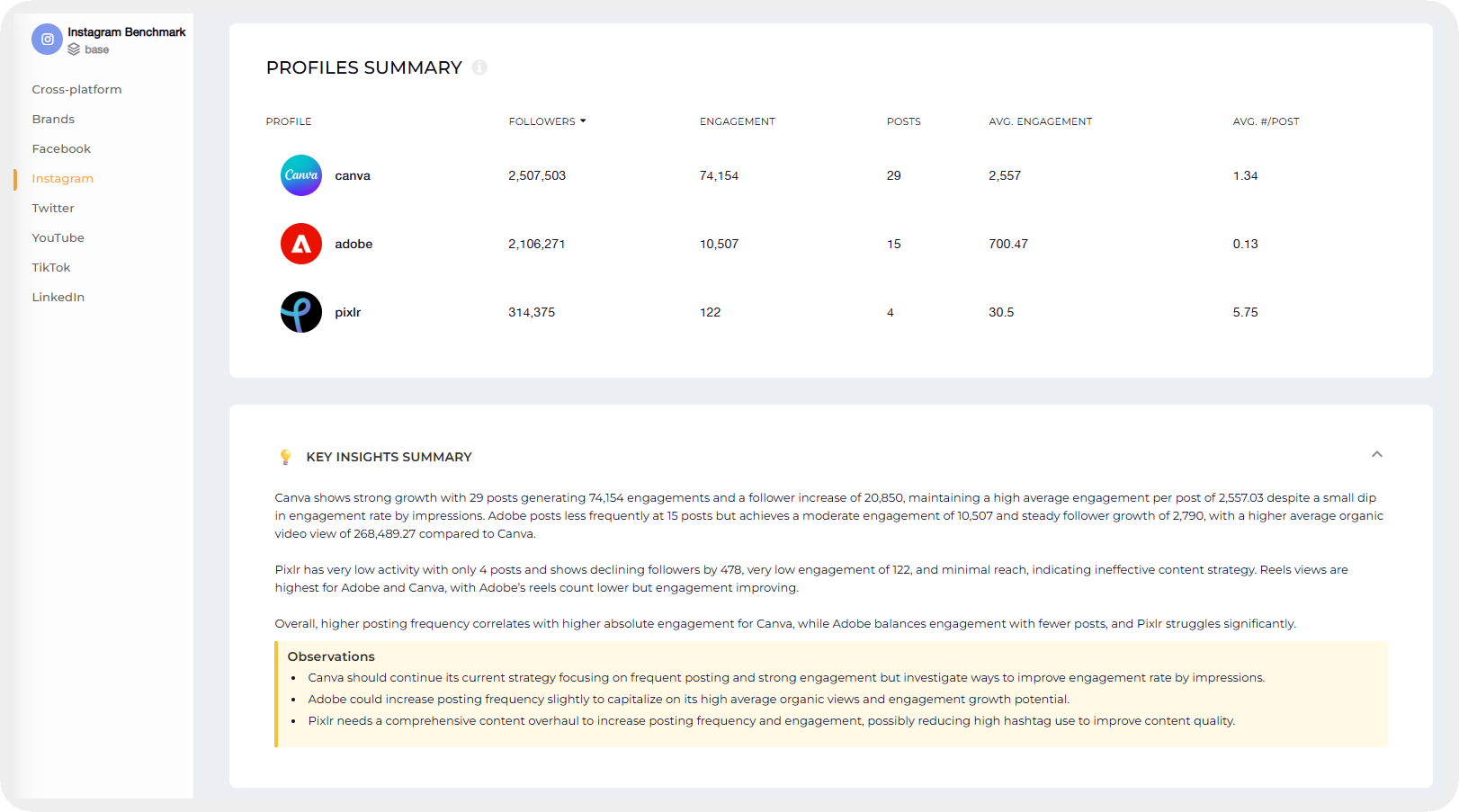
This is the part that makes a dashboard actually feel like a dashboard. I don’t want to check Instagram in one tab, LinkedIn in another, and TikTok somewhere else. I want everything in one place.
A good social media dashboard pulls data from all your platforms and brings it into a single, unified view. That means I can compare performance across channels without switching contexts or trying to mentally piece things together.
It also makes patterns easier to spot. Maybe LinkedIn is driving more engagement while Instagram is better for reach. When everything sits side by side, those insights become obvious.
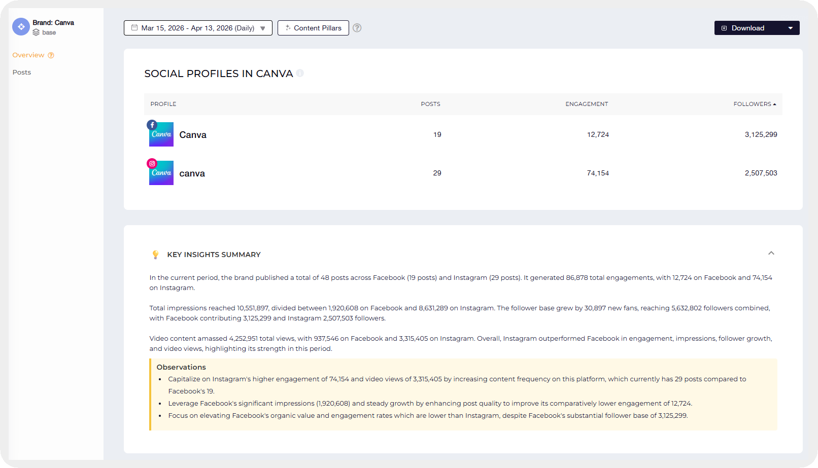
Tools like Socialinsider do this really well. For example, you can see how a brand like Canva performs across platforms in one clean dashboard, which makes analysis faster and way more intuitive.
Customizable reporting and data visualization
This is where creating a social media dashboard starts to feel personal. Not every team cares about the same metrics, so I want the flexibility to choose what actually matters to my goals instead of being stuck with a default view.
A good dashboard lets you customize reports around your KPIs. If I care about engagement and content performance, that’s what I want front and center. If someone else is focused on conversions or social media ROI, their view should reflect that.
Socialinsider helps to do exactly that by choosing which metrics go on your dashboard.
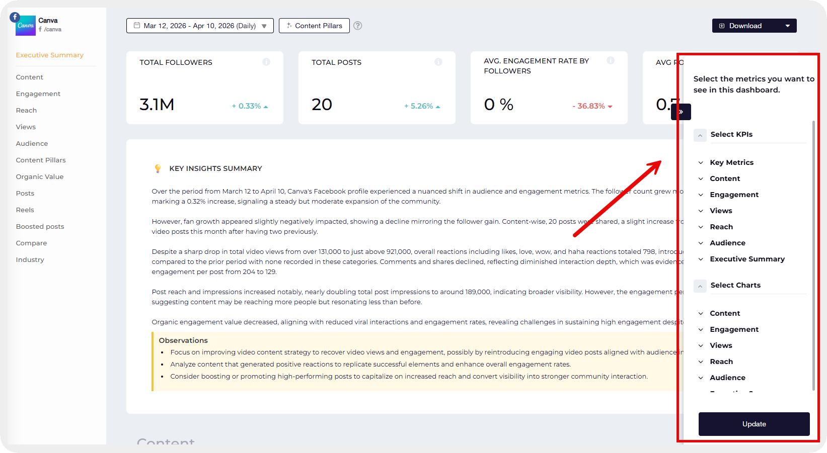
It’s also not just about what data you see, but how you see it. Numbers alone can feel overwhelming. Charts, graphs, and simple tables make patterns easier to understand at a glance.
Competitor benchmarking data
This is where things get really interesting for me. Looking at your own performance is useful, but it only tells half the story. I always want to know how we’re doing in context.
A good dashboard for social media lets you compare your metrics against competitors for the same time period. That’s when you start seeing what’s actually working in your space. Maybe your engagement looks solid on its own, but compared to competitors, there’s room to improve. Or maybe you’re outperforming them without even realizing it.
It also helps uncover gaps. If a competitor’s content is consistently getting more traction, that’s a signal worth exploring.
Socialinsider helps me see this in an easy-to-understand dashboard that shows a quick summary of performance against competitors and a side-by-side comparison of metrics.
Key metrics to include in your social media dashboard
Depending on your goal, you may want to include one or more of these metric categories.
Engagement metrics
These are the metrics you want to include if you want to see how many people are interacting with your content.
- Likes, comments, saves, and shares: These are your raw engagement signals. Likes show quick approval, comments tell you people are interested enough to respond, saves usually mean the content is valuable, and shares are a strong indicator that it resonated enough to pass along.
- Engagement rate: This puts everything into perspective. Instead of just looking at total interactions, it shows how engaged your audience is relative to your reach or followers. It’s one of the most reliable ways to judge content performance.
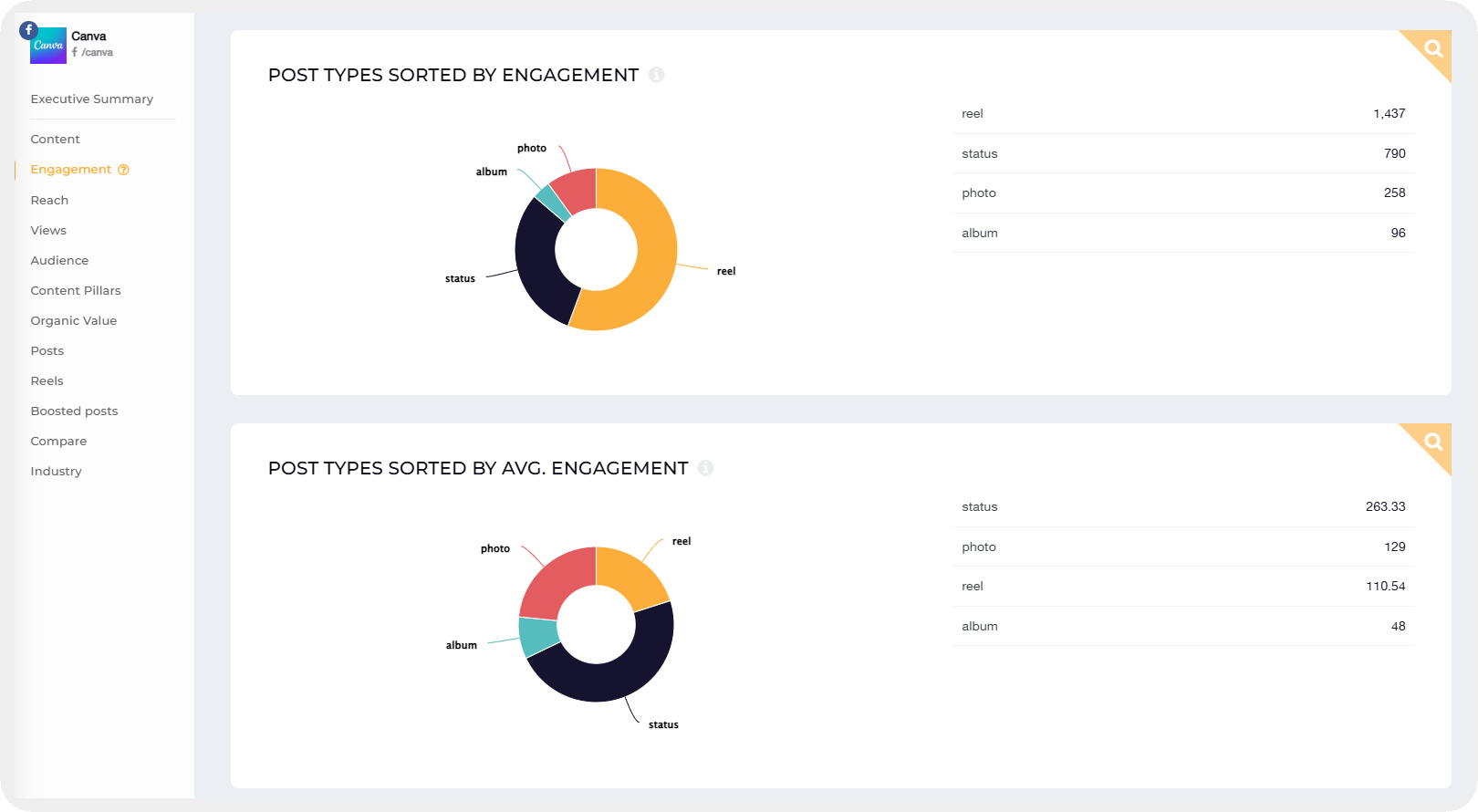
- Post types by engagement: This helps you see what formats are working best. Maybe carousels drive more engagement on LinkedIn while videos get more engagement on Instagram. It gives you clear direction on what to create more of on each platform.
Awareness metrics
If you are a new page or want to raise awareness of your product or profile, awareness metrics are the ones you should prioritize in your dashboard.
- Post reach: This shows how many unique people saw your content. It’s a good indicator of how well your posts are being distributed and whether you’re getting in front of new audiences.
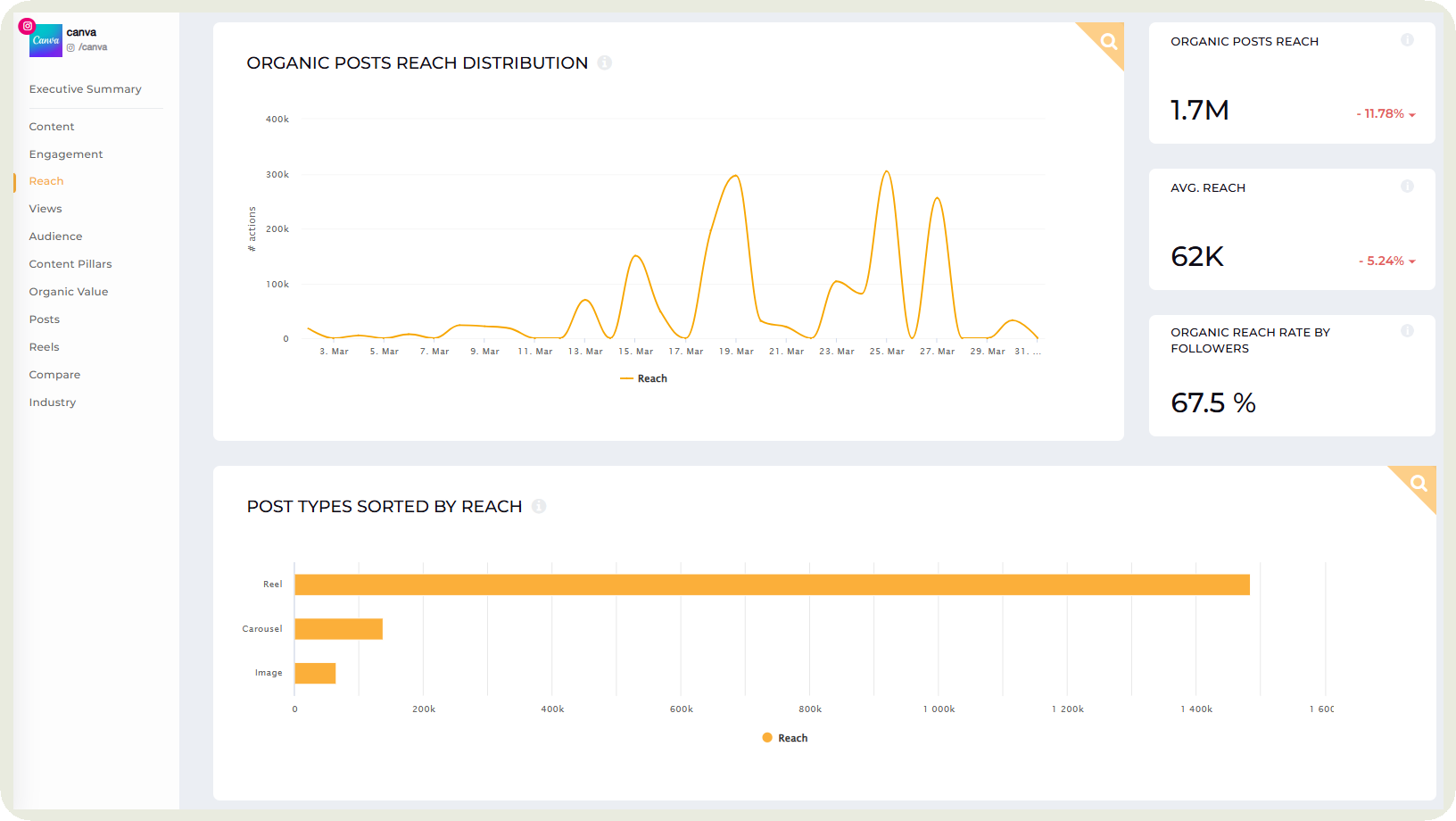
- Post types by reach: Not all content formats perform the same. This helps you spot which types of posts get the most visibility, whether it’s reels, carousels, or static posts, so you can lean into what gets seen more.
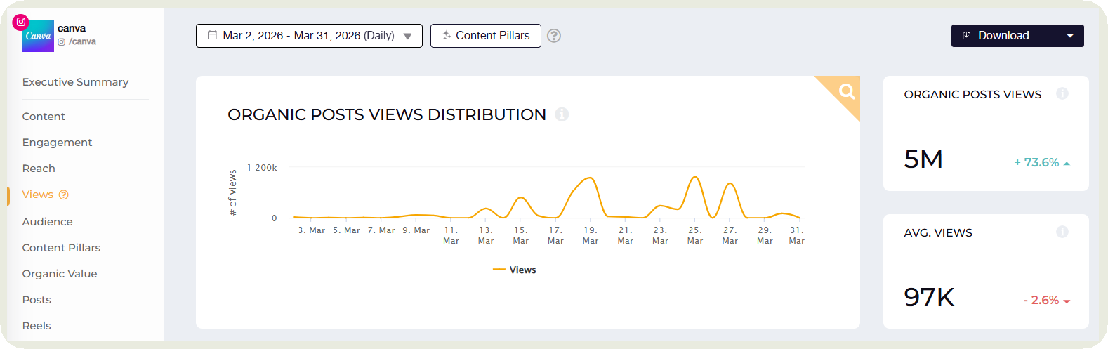
- Views: This tracks how many times your content was viewed. It’s especially useful for video content where repeat views can signal strong interest or replay value.
Audience metrics
This is where I go to understand who we’re actually reaching and whether that audience is growing in the right direction.
- Follower growth: This shows how your audience is evolving over time. A steady increase usually means your content is attracting the right people, while sudden spikes or drops can point to specific campaigns or changes worth looking into. In Socialinsider, you can click on any drop and see which posts might have led to it.
- Demographic divide: This breaks down your audience by factors like age, gender, location, or industry. It helps you see if you’re reaching the audience you intended to target, or if there’s a mismatch between your content and who’s engaging with it.
Content performance metrics
Are you trying to nail down your content strategy? It’s not just about how much engagement you’re getting, but what kind of content is actually driving it.
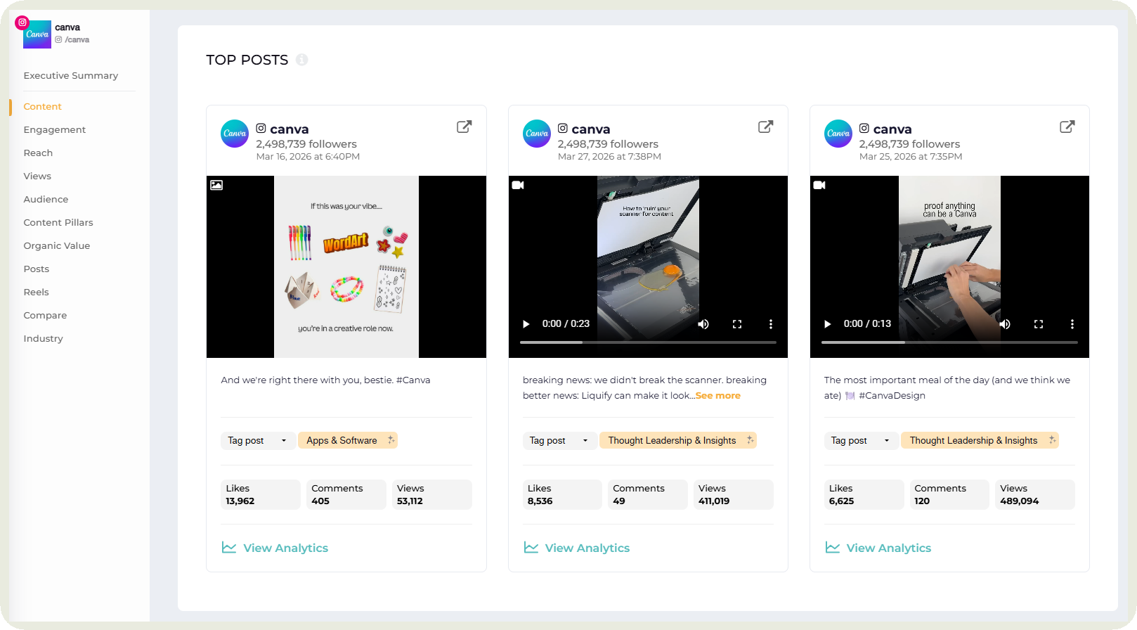
- Top performing content: This shows you which posts are getting the most engagement. I usually look at this to quickly understand what’s resonating. Patterns start to emerge. Maybe certain topics, formats, or tones consistently do better.
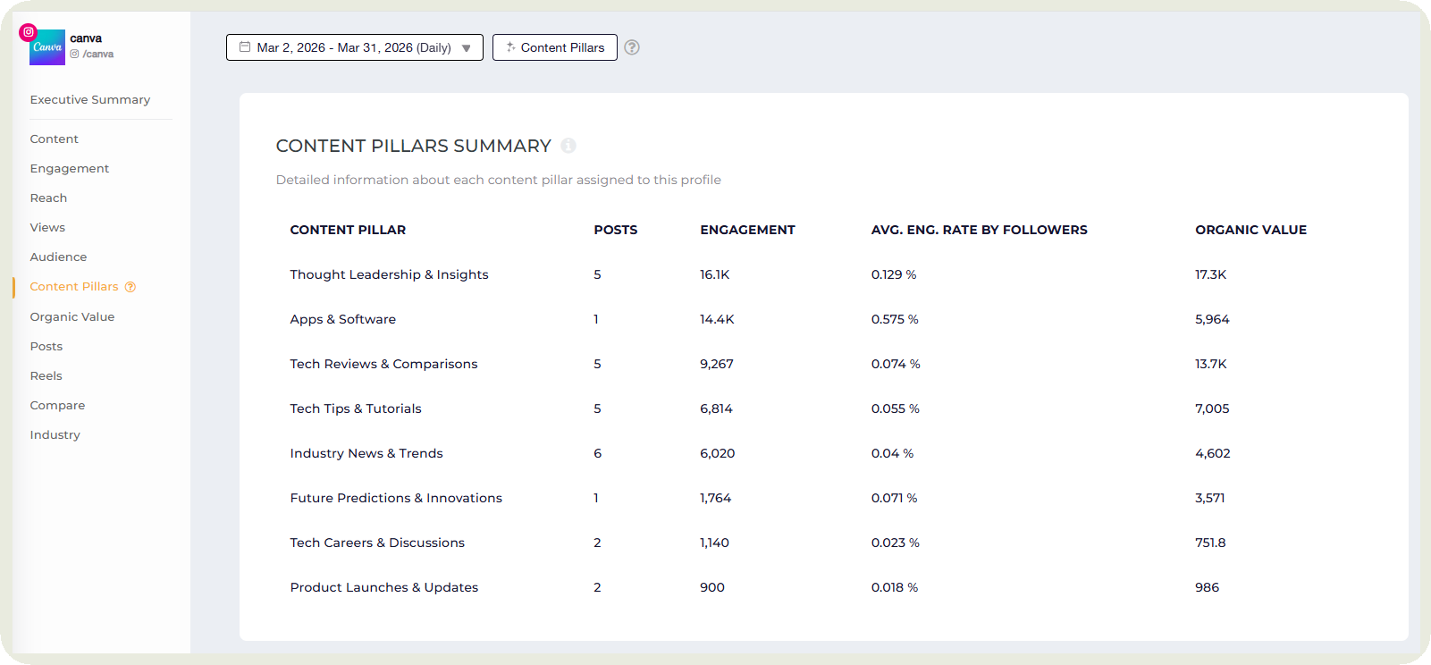
- Content pillar analysis: This groups your content into themes or categories and shows how each one performs. It helps you see which content pillars are worth investing in and which ones might need a rethink.
Conversion metrics
In your dashboard, this will show where social media starts tying back to actual business impact. I usually look here to understand if our content is not just engaging but also driving action.
- CTR (Click-through rate): This shows how many people clicked on your link after seeing your content. It’s a good indicator of how compelling your copy, visuals, or call-to-action really are.
- Conversion rate: This takes it a step further. Out of the people who clicked, how many actually completed the desired action, like signing up or making a purchase. It helps you understand the quality of traffic coming from social.
- CPA (Cost per acquisition): This tells you how much you’re spending to acquire a customer or lead. It’s especially useful for paid campaigns and helps you evaluate whether your efforts are cost-effective.
C-level or executive-level metrics
This is the section I think about when I’m reporting to leadership. At this level, it’s less about individual posts and more about how social media is contributing to the bigger picture.
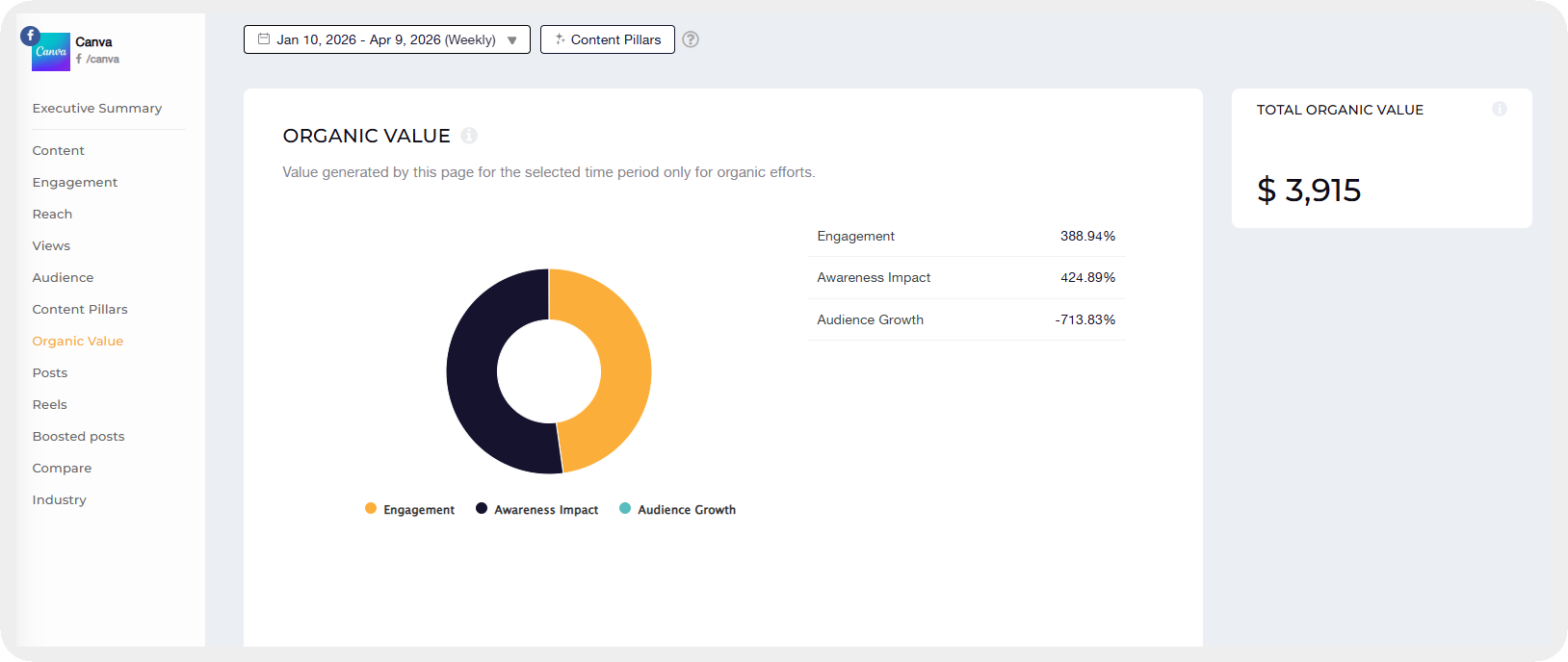
- Organic value: This estimates the value of your organic performance as if you had paid for the same reach or engagement. It helps show the impact of your content without ad spend.
Socialinsider shows you this value for a certain time period and you can define the values for each action.
- ROI (Return on investment): This measures how much social media value you’re generating compared to what you’re investing. It’s one of the clearest ways to justify effort and budget.
- ROAS (Return on ad spend): Specifically for paid campaigns, this shows how much revenue you’re generating for every dollar spent on ads. It’s a key metric for evaluating campaign efficiency.
- CLV (Customer lifetime value): This looks beyond one-time conversions and focuses on the long-term value a customer brings. It helps connect social media efforts to sustained business growth.
What data to focus on when creating a dashboard for your leadership team?
A dashboard built for your leadership team serves a completely different purpose than the one your social media team uses every day. If you're thinking about how to structure the reporting layer that sits on top of it, the guide on executive reporting covers exactly that.
An important mention I need to make is to remember these important distinctions: your team needs depth — post-level data, content pillar breakdowns, format comparisons. Leadership needs clarity — a fast, high-confidence read on whether social media is moving in the right direction and what it means for the business.
Getting this wrong is more common than it sounds. When social media leaders share their full working dashboard with executives, one of two things tends to happen: leadership either disengages from the data entirely because there's too much to parse, or they fixate on the wrong metric — usually follower count — because it's the one number they recognize. Neither outcome helps you.
A dashboard designed for leadership consumption should be built around a short, stable set of metrics that connect directly to business outcomes. Think in terms of four to five indicators:
- Organic value. Translates your social performance into a monetary equivalent leadership already understands — what it would have cost to generate the same reach and engagement through paid media.
- Share of voice vs. key competitors. Answers the question executives actually ask: are we gaining or losing ground in our market? A single trend line here carries more weight in a boardroom than a full engagement report.
- Follower growth benchmarked against industry. Raw follower numbers mean little without context. Showing growth relative to competitors or industry averages gives leadership the comparison point they need to assess performance accurately.
- Engagement rate trend. Not a snapshot, but a direction. Is audience connection improving, holding, or declining quarter over quarter? That trajectory is what leadership needs to see, not the absolute number.
- Top-line conversion or revenue from social. Where it applies, this is the clearest link between social activity and business outcomes — and the metric most likely to secure continued investment.
The other design principle worth following: keep it automated. A leadership dashboard that requires manual updating will always be slightly out of date, which is exactly when it loses credibility. Set up scheduled delivery so the right numbers land in the right inboxes before every planning meeting — without anyone having to chase them.
How to build a social media dashboard in 5 steps?
Here’s a step-by-step process to building an effective social media dashboard.
Step 1: Define your goal and select relevant social media KPIs
This is where I slow down a bit before jumping into building anything. It’s tempting to start pulling data right away, but without a clear goal, the social dashboard just turns into a collection of random numbers.
I usually ask myself one simple question. What am I trying to achieve with social media right now?
If the goal is awareness, I focus on reach and views. If it’s engagement, I look at engagement rate, comments, and shares. If it’s conversions, then clicks, conversion rate, and revenue take priority.
Each goal leads to a different set of social media KPIs, and those KPIs decide what actually deserves a spot on the dashboard.
Step 2: Decide what kind of dashboard to create
Once I know what I’m tracking, the next step is deciding how I want to look at that data. And honestly, this is not just about me. It depends a lot on what stakeholders care about.
If I’m building this for a marketing team, the structure might look very different than something meant for leadership. So I usually start by asking, who is this social analytics dashboard for and what do they want to see?
Here are three of the most common ways to structure it:
- By channel: Great when you want a clear view of how each platform is performing. This works well for social media managers who need platform-specific insights.
- By campaign: Useful when you’re running specific campaigns and want to track performance from start to finish. Stakeholders often prefer this when evaluating results of a launch or initiative.
- By funnel: Ideal for leadership. It shows how social media contributes across awareness, engagement, and conversions, tying everything back to business impact.
Step 3: Gather the data
This is the step where things can either get messy or surprisingly smooth. I’ve done it both ways.
Manually pulling data means logging into each platform, exporting reports, copying numbers into spreadsheets, and double-checking everything. It works, but it takes time and it’s easy to miss something or make errors along the way.
The easier route is using a tool like Socialinsider. It pulls data from all your platforms into one place automatically and even builds the social media analytics dashboard for you.
I’ve found that once data collection is handled, everything else becomes faster. You spend less time gathering numbers and more time actually understanding what they’re telling you.
Step 4: Pick visualization types and design for clarity
Now that the data is here, you need to present it in a logical and clear way.
When choosing visualizations:
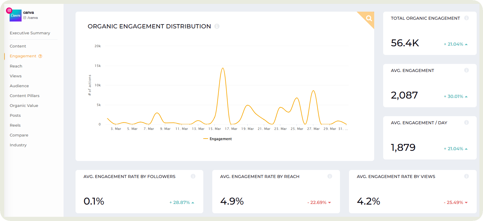
- Line charts for trends: Perfect for seeing how things change over time. I usually use these for engagement rate, follower growth, or reach because patterns become obvious instantly. Socialinsider presents data just like this for easy analysis.
- Bar charts for comparisons: Great when I want to compare performance. For example, post types, platforms, or campaigns side by side.
- Funnels for conversions: Useful when tracking a journey. From impressions to clicks to conversions, it helps me see where drop-offs are happening.
Here are some visual hierarchy principles you should put to use:
- Put your most important metrics at the top: This is what I look at first. It should answer the main question immediately.
- Use size and placement intentionally: Bigger charts draw attention. Supporting data can sit below or to the side.
- Group related metrics together: Engagement metrics in one section, audience data in another. It keeps things easy to scan.
- Avoid clutter: If everything looks important, nothing is. I try to keep it clean so social media insights stand out quickly.
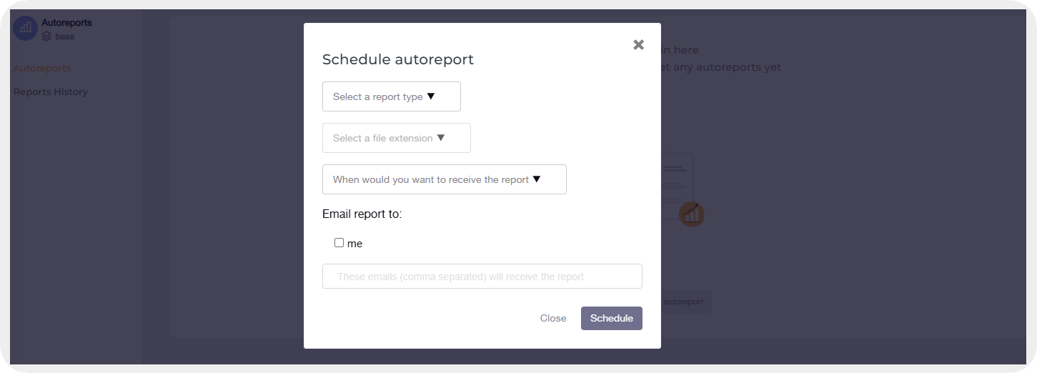
Step 5: Automate and share
This is the step that saves the most time in the long run. Once your dashboard is set up, the last thing you want is to rebuild the same report every week.
I like setting things up so reports go out automatically. Weekly for quick check-ins, monthly for deeper social media analysis, and sometimes quarterly for bigger-picture reviews. It keeps everyone in the loop without constant follow-ups.
Tools like Socialinsider make this really easy. You can automate reports and share them directly with stakeholders, so they always have access to the latest data.
5 social media dashboard examples
Not all dashboards are built the same. I’ve realized the best ones are designed around who needs them and what decisions they’re trying to make. Here are five you can take inspiration from.
Executive reporting dashboard
This is the dashboard I turn to when I need to tell a clear story, fast. Just the numbers that matter and what they mean. It’s built for quick understanding, especially when someone senior is asking for an update and expects a straight answer without digging through details.
- What it should contain: High-level KPIs like overall social media engagement, follower growth, ROI, and a short executive summary that explains key wins, dips, and next steps.
- Audience: Founders, CMOs, and leadership teams who care about impact, not individual posts.
- Reporting cadence: Monthly works best, with quarterly summaries for bigger strategic conversations.
Cross-platform performance dashboard
This is what I use when I want to see how everything is performing side by side. Instead of checking each platform separately, I get a unified view. It helps me quickly understand which channels are pulling their weight and where I should focus more attention.
- What it should contain: Engagement, reach, follower growth, and top-performing content across each platform, laid out side by side for easy comparison.
- Audience: Social media managers and growth teams who are actively optimizing content and social media strategy.
- Reporting cadence: Weekly for quick adjustments, monthly for a more complete view of performance.
Social media organic value dashboard
This one helps me make sense of something that’s usually hard to explain. The value of organic efforts. It takes all the content we’re putting out and translates it into something more tangible, which makes conversations around impact a lot easier.
Socialinsider lets you automatically calculate this by assigning a monetary value for each action.
- What it should contain: Organic reach, engagement, estimated media value, and trends that show how your content is performing over time.
- Audience: Marketing leads and decision-makers evaluating the impact of organic vs paid efforts.
- Reporting cadence: Monthly for consistency, with quarterly rollups for bigger insights.
Social media boosted content dashboard
This is the dashboard I rely on when there’s budget involved. Once money is in the mix, I want a clear view of what’s working and what’s not. It helps me stay on top of performance and make quick adjustments without overthinking it.
- What it should contain: Spend, impressions, clicks, CTR, conversions, and cost per acquisition, along with performance trends over time.
- Audience: Paid social teams, performance marketers, and anyone responsible for campaign results.
- Reporting cadence: Weekly during active campaigns, with monthly summaries for overall performance.
Competitor analysis dashboard
Looking at your own data is useful, but I always want to know how we stack up against others. This dashboard helps me see what’s normal, what’s exceptional, and where we might be missing opportunities.
- What it should contain: Competitor engagement rates, posting frequency, top-performing content, and growth trends, all benchmarked against your own performance.
- Audience: Strategy teams, social media managers, and leadership looking for competitive insights.
- Reporting cadence: Monthly for regular tracking, with deeper quarterly analysis for strategy shifts.
Best social media reporting and dashboard tools
Native analytics
I’ve definitely spent my fair share of time inside native analytics. Instagram Insights, LinkedIn Analytics, TikTok Analytics. They’re usually the first place I go when I want a quick, no-setup-required look at performance. Everything is already there, tied directly to the platform, and updated in real time.
What I like about native tools is how straightforward they feel. If I want to check how a post performed or how my audience is growing, I can get that answer in seconds.
That said, things start to feel a bit scattered once you’re managing multiple platforms. I find myself switching tabs, mentally stitching together insights, and wishing I could see everything in one place.
Still, for quick checks and platform-specific insights, native analytics are always a solid starting point.
Socialinsider
This is where things start to feel a lot more streamlined. Instead of juggling multiple platforms, I get everything in one place, already organized and visualized. It saves me from the usual back-and-forth and lets me focus on actually understanding the data.
What I like most is how it doesn’t just show numbers, it shows patterns. Engagement trends, top-performing content, competitor benchmarks. It all comes together in a way that makes sense without needing extra effort.
It’s also great for reporting. I can generate clean, ready-to-share dashboards without spending hours building them manually. And when I’m working with teams or stakeholders, that clarity makes a big difference.
If native analytics feel like raw data, this feels like a layer on top that turns everything into insights you can actually use.
Looker Studio
Looker Studio is what you should reach for when you want full control. It’s flexible, customizable, and helps build dashboards exactly the way you want them. If you have a specific vision in mind, this is where you can bring it to life.
You can connect multiple data sources, design custom layouts, and tailor everything to match your reporting needs. It’s especially useful when working with different datasets beyond just social media.
That said, it does take a bit more effort. Setting things up, connecting data, designing charts. It’s not something I would jump into for quick insights.
Best practices for building a social media dashboard
- Design for decisions: This is something I’ve learned the hard way. A dashboard should help you decide what to do next, not just show what happened. Every metric on the screen should answer a question or guide an action.
- Always have an executive summary: I like starting with a quick summary that tells me what actually matters. A few key takeaways, what worked, what didn’t, and what needs attention. It saves time and sets the context before I dive into the details.
- Use a layered depth approach: I think of this like zooming in. At the top, I want a quick overview. As I scroll, I get into trends, and then deeper into specifics. It keeps the dashboard clean while still giving me everything I need when I want to explore further.
- Use comparative context: Numbers on their own don’t mean much. I always want to see how things are changing. Compared to last week, last month, or even competitors. That context is what turns data into something I can actually interpret and act on.
Final thoughts
A social media dashboard is only as useful as the decisions it helps you make. I’ve found it works best when I treat it as something I check regularly, not just when I need to report.
Start with a clear goal, keep your metrics focused, and build a view that actually answers your key questions. Review it weekly, adjust what’s not working, and refine it as your strategy evolves.
Over time, patterns start to stand out and decisions become faster and more confident. You stop guessing and start acting on data that makes sense.
Nidhi Parikh
Nidhi Parikh is SaaS writer that believes scrolling through social media is research for work. When not working, find her binge watching the latest series or reading anything she can get her hands on.

Know what your competitors do — before your manager asks
Get instant social benchmarks & reports without manual work.


