LinkedIn Carousel: Performance Data, Tips and Best Practices
Discover LinkedIn carousel engagement benchmarks and best practices here, plus real examples and how to measure their performance against other content formats.

You put time into a LinkedIn post, refine every sentence, and hit publish.
Only to watch it disappear into the feed. I know how frustrating it is when a useful idea never reaches the people who need it.
A LinkedIn carousel gives your content more room to breathe.
By breaking an idea into clear, visual slides, you can hold attention, explain complex topics, and make your LinkedIn marketing more memorable.
In this guide, I’ll show you how to plan, design, format, upload, and publish a LinkedIn carousel post step by step.
Let’s get started.
Key takeaways
- Native document carousels achieve LinkedIn's highest average engagement rate at 6.90%, outperforming images at 5.00%, even though brands publish them far less often (2x/month vs. 7x/month) — proving format matters more than posting volume.
- Effective LinkedIn carousels use an outcome-led hook on the cover slide, 8–12 slides with one idea per slide, consistent visual rhythm, mobile-optimized design (portrait 4:5 for attention, square for repurposing), an explicit swipe prompt in the caption, and a single clear CTA placed on the final slide.
- To prove LinkedIn carousels work, track impressions/reach for awareness, reactions/comments/reposts for interaction, and clicks/conversions for business impact — then compare results across multiple carousel posts (not just one) against other formats using a tool like Socialinsider.
Organic vs paid LinkedIn carousels: what are the main differences?
They may look similar in the feed, but they serve different goals.
Organic carousels on LinkedIn are PDF documents shared from a personal profile or company page.
You don’t pay for distribution; reach depends on your audience, the quality of the post, and how people engage with it.
Personally, I choose this format especially for educational content, such as practical tips, original insights, or step-by-step guides. It’s useful for building credibility and encouraging saves, comments, and shares over time.
Paid LinkedIn carousel ads are created in Campaign Manager and use a series of individual image cards.
You set a budget, choose a target audience, and can add separate headlines and destination links to the cards. This gives you more control over who sees the content and what action they take.
The right choice comes down to your goal: use organic carousels to grow trust and social media engagement, and paid carousel ads when you need targeted reach, website traffic, leads, or measurable campaign results.
Why should social media managers integrate more LinkedIn carousels into their posting strategy?
Social media managers are always under pressure to publish more, but more content doesn’t automatically mean better results.
Sometimes, the format matters far more than the volume.
Based on Socialinsider’s recent social media posting frequency study, native documents—the format used for organic LinkedIn carousels—achieve the platform’s highest average engagement rate at 6.90%, despite brands publishing only two per month on average.
Images, by comparison, are posted seven times per month but generate a lower 5.00% LinkedIn engagement rate.
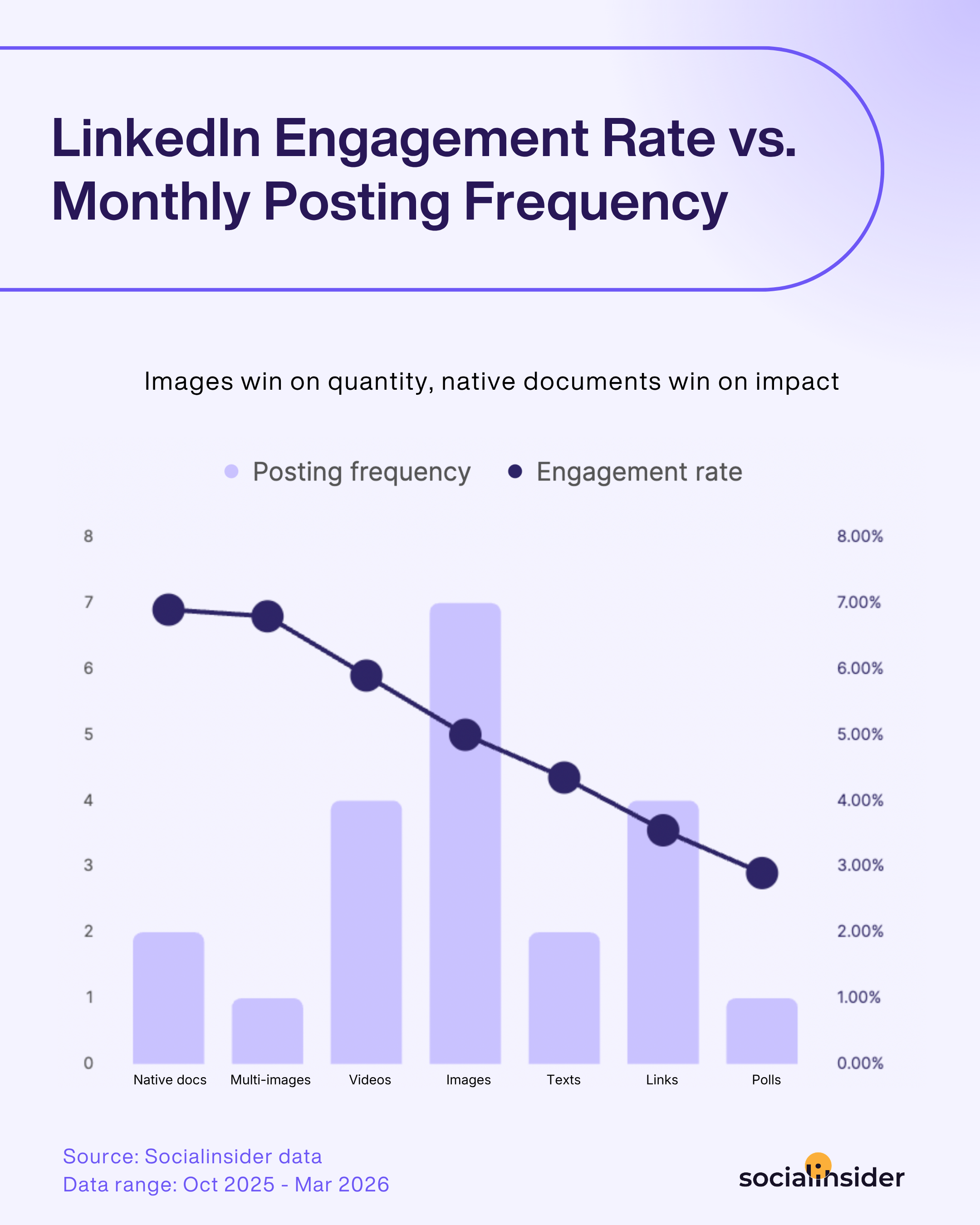
That gap is a good reason to look beyond the formats that are quickest to produce.
LinkedIn carousel posts invite people to pause, swipe, and explore an idea slide by slide.
They give social media managers enough space to share practical advice, simplify complex topics, repurpose reports, or turn a long-form article into something easier to consume.
However, I wouldn’t replace every image or text post with a carousel.
But adding more native documents to the social media content mix can help a brand deliver greater value without simply increasing its posting frequency.
Start with one strong LinkedIn carousel, track how your audience responds, and use your own performance data to decide how often the format belongs in your LinkedIn growth strategy.
LinkedIn carousel specs: 2026 edition
As mentioned above, LinkedIn supports two carousel-style formats: organic document posts and paid carousel ads.
If you want to post a carousel on LinkedIn, use the specifications that match your format.
Organic document posts
- Formats: PDF, PPT, PPTX, DOC or DOCX
- Maximum size: 100 MB
- Maximum length: 300 pages
- Limit: One document per post
Paid carousel ads
- Cards: 2–10
- Formats: JPG, PNG or non-animated GIF
- Maximum size: 10 MB per card
- Recommended dimensions: 1080 × 1080 px
- Introductory text: 255 characters maximum; keep it under 150 to reduce truncation
For either format, use consistent dimensions throughout and preview the carousel on mobile before publishing.
LinkedIn carousel best practices
There isn’t one carousel formula that works for every audience, so I’d approach LinkedIn carousel best practices the same way I approach broader LinkedIn best practices: as hypotheses to A/B test, not fixed rules.
The ideas below cover the main elements that shape performance, from the first swipe to the final CTA.
Test one variable at a time and judge the results using swipe-through, completion, and save rates.
We’ll explore how to measure those signals later in the guide.
#1. Hook and cover slide: earning the first swipe
Your cover should give readers a specific reason to continue.
“5 LinkedIn Marketing Tips” names a topic, but it doesn’t communicate what someone will gain from swiping.
Lead with a clear outcome or unresolved tension instead: “How We Cut LinkedIn Reporting Time in Half” or “Why Your Best LinkedIn Posts Aren’t Generating Leads.”
A number, bold claim, question, or contrarian statement can interrupt the scrolling pattern, provided the rest of the carousel delivers on it.
Test an outcome-led headline against a curiosity-driven one, then compare how many readers move beyond the cover.
#2. Slide-by-slide structure and pacing
Each slide should communicate one idea and create a reason to view the next.
Begin with the problem, develop the argument or process in a logical order, and finish with a useful takeaway. Avoid squeezing several points onto one slide simply to make the carousel shorter.
A 2026 analysis of 67,765 LinkedIn carousels conducted by MagicPost found that 9–12-slide posts received 49 median likes, compared with 26 for 6–8 slides.
However, engagement continued rising for longer decks, showing that 8–12 slides is a sensible starting range rather than a hard limit. Longer carousels can work when every slide adds substance, but unnecessary slides create more opportunities for readers to leave.
Keep the visual rhythm consistent throughout.
Reuse the same layout patterns, margins, type scale, colors, and navigation cues so readers can focus on the message rather than adjusting to a new design on every slide.
#3. Design and readability standards for mobile
Portrait slides in a 4:5 ratio—typically 1080 × 1350 px—take up more vertical space in the mobile feed than square slides.
That makes portrait a strong hypothesis to test for attention, dwell time, and swipe-through rate.
Square slides at 1080 × 1080 px remain useful when content needs to be repurposed across platforms.
Reserve landscape layouts for charts, tables, timelines, and other data-heavy visuals that genuinely need more horizontal space. On mobile, landscape slides appear smaller and may force readers to zoom.
Whichever format you choose, use large type, strong contrast, short text blocks, and generous spacing.
Compare portrait and square versions using similar content rather than assuming that one format will always perform better.
#4. Copy and caption best practices
Don’t rely on the carousel format alone to trigger a swipe.
Tell readers what to do and what they’ll receive: “Swipe for the framework,” “See the process step by step,” or “Keep swiping for the results.” Test an explicit prompt against a caption that creates curiosity without directly asking for the swipe.
Keep each slide focused on one message. Use the caption to introduce the problem, add context, and explain why the carousel matters.
Place the primary CTA on the final slide, after the reader has received the promised value.
Use a save prompt for frameworks, checklists, or tutorials; ask for a share when the content could help someone else; and use a link-out when the carousel naturally leads to a template, report, product, or deeper resource.
Avoid combining several competing actions. Test one CTA at a time and track saves, shares, clicks, and completion to learn which next step best matches the reader’s intent.
How to measure carousel performance and prove it's working
Before you create a LinkedIn carousel post, decide whether you want to increase awareness, encourage conversation, drive traffic, or generate leads.
Then match that goal with the right LinkedIn metrics:
- Track impressions, reach, and follower growth for awareness
- Track reactions, comments, reposts, and engagement rate for interaction
- Track clicks, website sessions, leads, and conversions for business impact
What you need to do next is review these results across several carousel posts on LinkedIn and compare them with other formats published during a similar period.
Because one successful carousel could be an exception; repeated improvement in engagement rate or conversions is much stronger evidence that the format is working.
Doing this manually in native LinkedIn analytics can become time-consuming, especially when you need historical comparisons, competitor data, or regular reports.
That’s when third-party LinkedIn analytics tools become useful.
Socialinsider, for example, simplifies social media data collection and analysis by bringing everything into one comprehensive dashboard.

Its Post types sorted by engagement report, shown above, compares carousels with images, videos, polls, and other formats, revealing which ones generate the strongest response.
You can then filter posts by engagement rate, reach, interactions, or content pillar to uncover the topics and creative approaches behind that performance.
Historical trends show whether those results are consistent, while competitor and industry benchmarks provide context for evaluating them. Socialinsider also lets you export the findings into reports for clients or internal stakeholders.
LinkedIn carousel examples worth stealing (by goal)
A strong carousel starts with a clear goal.
In LinkedIn B2B marketing, knowing what you want the audience to do next makes it much easier to decide what to post on LinkedIn.
The examples below show how different carousels can build awareness, encourage conversation, drive traffic, or generate leads.
Awareness
Atlassian shows how B2B brands can use original research to build awareness around their expertise.

The carousel turns data from more than 2,200 engineering hires into a clear story about how new graduates use AI at work.
By connecting the findings with real employees, Atlassian makes the research more relatable while strengthening its association with AI productivity and modern teamwork.
Engagement
Figma shows how B2B brands can drive engagement by turning shared audience experiences into relatable content.

The carousel pairs playful visuals with inside jokes that designers immediately recognize.
This sense of familiarity gives readers a reason to react, share the post, or tag colleagues, generating interaction without relying on a promotional message.
Traffic
Notion is a good example of how B2B brands can use carousels to drive traffic.

Its carousel highlights key findings from a survey of 6,000 professionals, giving readers enough value to build interest in the topic.
The caption then links to the full AI Transformation Report, offering a natural next step for those who want the complete analysis.
Leads
Salesforce shows how a carousel can turn interest in an event into registrations.

The carousel promotes its Agentforce for Good Hackathon, explains who can participate, and highlights key dates and incentives.
A direct registration link then converts engaged readers into identifiable prospects, making the post a lead-generation asset rather than simply a traffic driver.
How to use AI to speed up LinkedIn carousel creation?
Creating every carousel from scratch is one of the fastest ways to exhaust your ideas—and your time.
I’ve found that AI produces much stronger work when it has a proven idea to build on, rather than an empty prompt asking it to create something engaging.
That’s why I start with the data.
I look at my top-performing content to identify the topics and angles that consistently capture attention, then choose the strongest asset for content repurposing.
This gives an already successful idea a second life in a more visual, swipeable format.
So if you want AI in B2B marketing to accelerate carousel creation without making the result feel generic, the process comes down to two steps: first, identify the right content to repurpose; then, use AI to turn its performance insights into practical recommendations for your carousel.
Here’s how Socialinsider can help with both:
- Best post identification
Socialinsider allows you to rank posts by metrics such as engagement, reach, or comments and tag them by content pillar.

This reveals not only which posts performed best, but which topics and angles repeatedly drove results, giving you a data-backed starting point for creating the best LinkedIn carousel posts.
- Recommendations through the Socialinsider MCP
The Socialinsider MCP connects Claude directly to your social media analytics data.

You can ask it to analyze your top posts, identify the patterns behind their performance, and recommend which asset to repurpose.
This turns data driven marketing insights into an actionable carousel brief without manually interpreting multiple reports.
From there, AI can help you develop the opening hook, organize the slide sequence, explore visual directions, and refine the CTA.
You still need to apply your brand knowledge and verify the final copy before posting a carousel on LinkedIn, but you’re no longer starting from zero.
Together, these two steps create a smarter social media content distribution workflow: Socialinsider helps you find an idea with proven potential, and its MCP helps you turn the supporting data into a practical plan for repurposing it.
Final thoughts
My rule is simple: use a carousel when an idea becomes stronger as it unfolds.
Start with a topic your audience has already validated, give every slide a reason to exist, and measure whether the post achieved its goal.
If you need, let AI speed up the work, but let the data choose the direction.
Then each carousel becomes a lesson for the next.

Anda Radulescu
Anda Radulescu is a SaaS content writer and copywriter with 5+ years in digital marketing, turning social media data into practical ideas for Instagram, LinkedIn, and beyond

Know what your competitors do — before your manager asks
Get instant social benchmarks & reports without manual work.